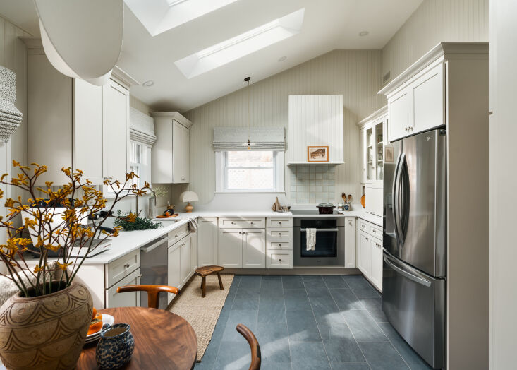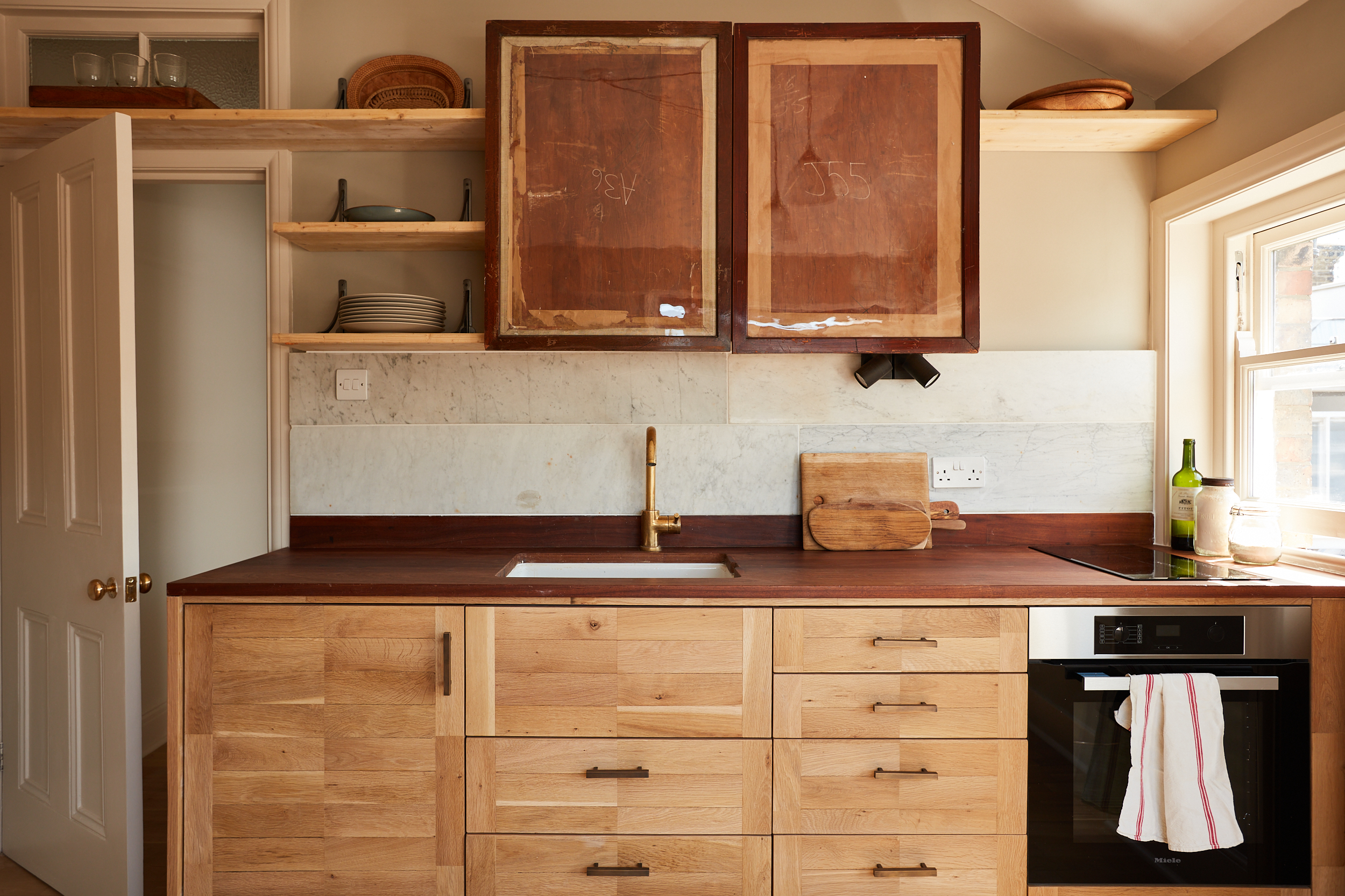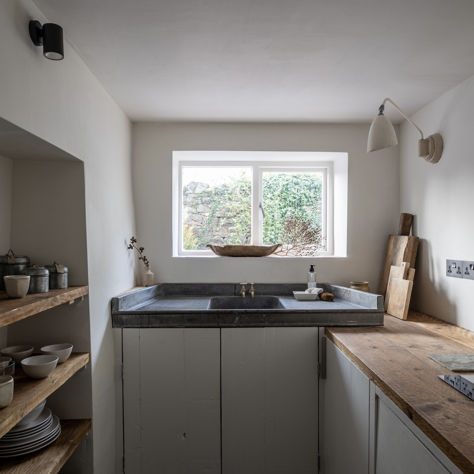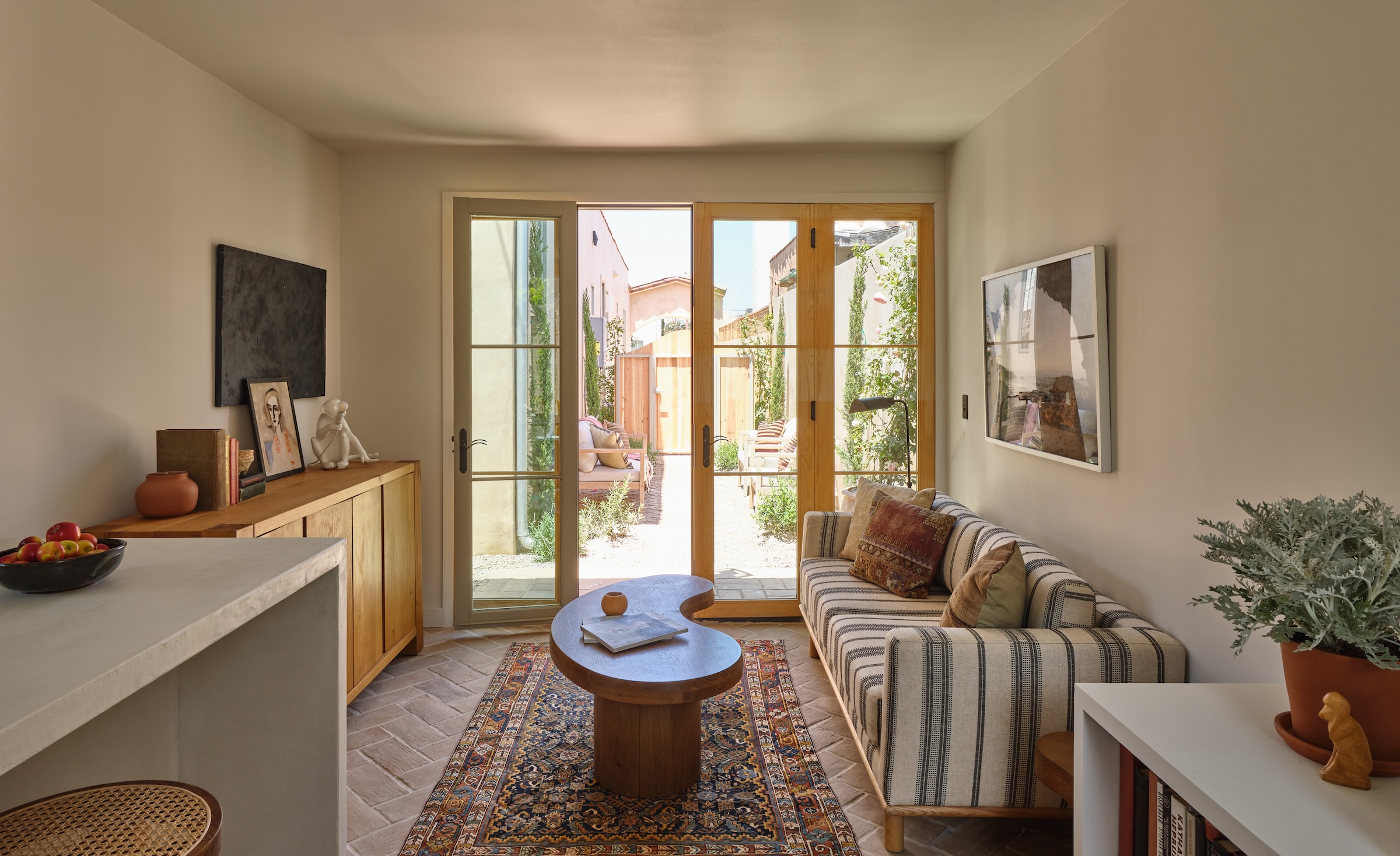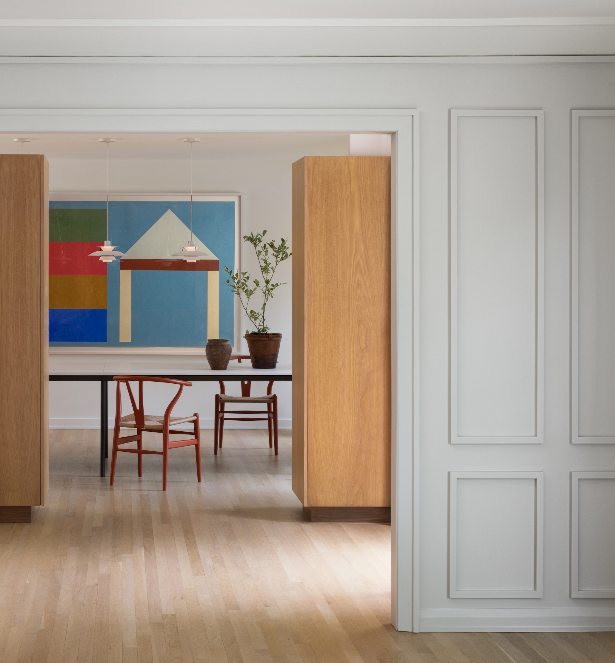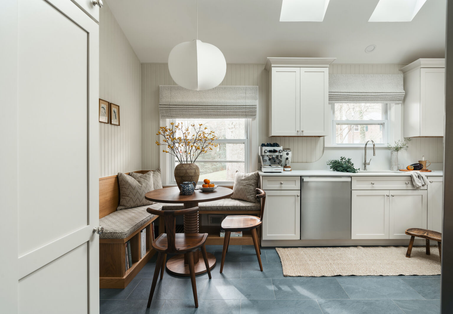
Interior designer Hollie Velten-Lattrell, of SPACES by Hollie Velten, has a unique of getting to know her clients. She doles out a deck of cards with prompts like “I left my heart in . . . ” and “The first thing I do in this space is . . . ” to sleuth out what what makes their souls soar and how they live their lives. The process is part investigative and part intuitive. “Some of the questions also create a sensorial story,” says Hollie. “We have a tray that represents how they answer cues around sight, sound, taste, hear, and touch in our concept meeting. We listen to a custom playlist while we design.”
By the time clients have completed all of her onboarding requests, she has everything she needs to deliver a highly personalized redesign. For this sweeping kitchen remodel for a young couple in Maplewood, NJ, Hollie honed in on their love for “Cotswold charm” and “Japanese simplicity.” The two spent much of Covid lockdown in the English countryside (he is British) and both are drawn to Japanese design. Additionally, Hollie was inspired by the show-and-tell objects they brought to their design meeting, another of her get-to-know-you assignments; he chose his Leica film camera for its simple functionality and she selected a cherished glazed Majorca pottery vessel for its timeless, rustic appeal.
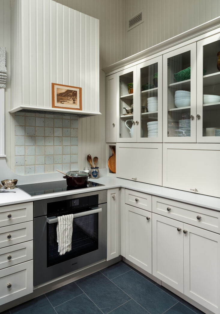
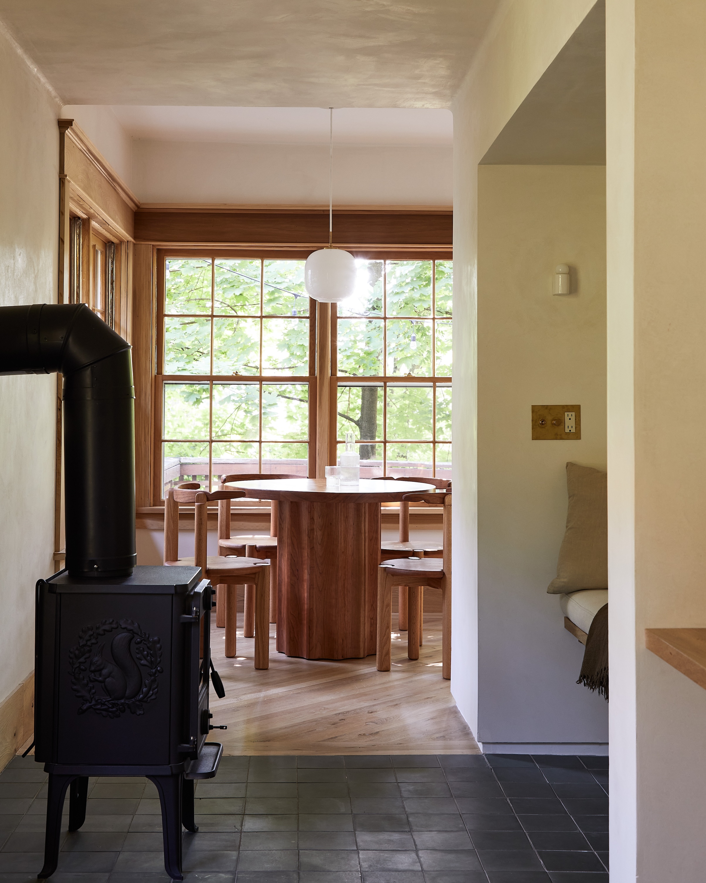
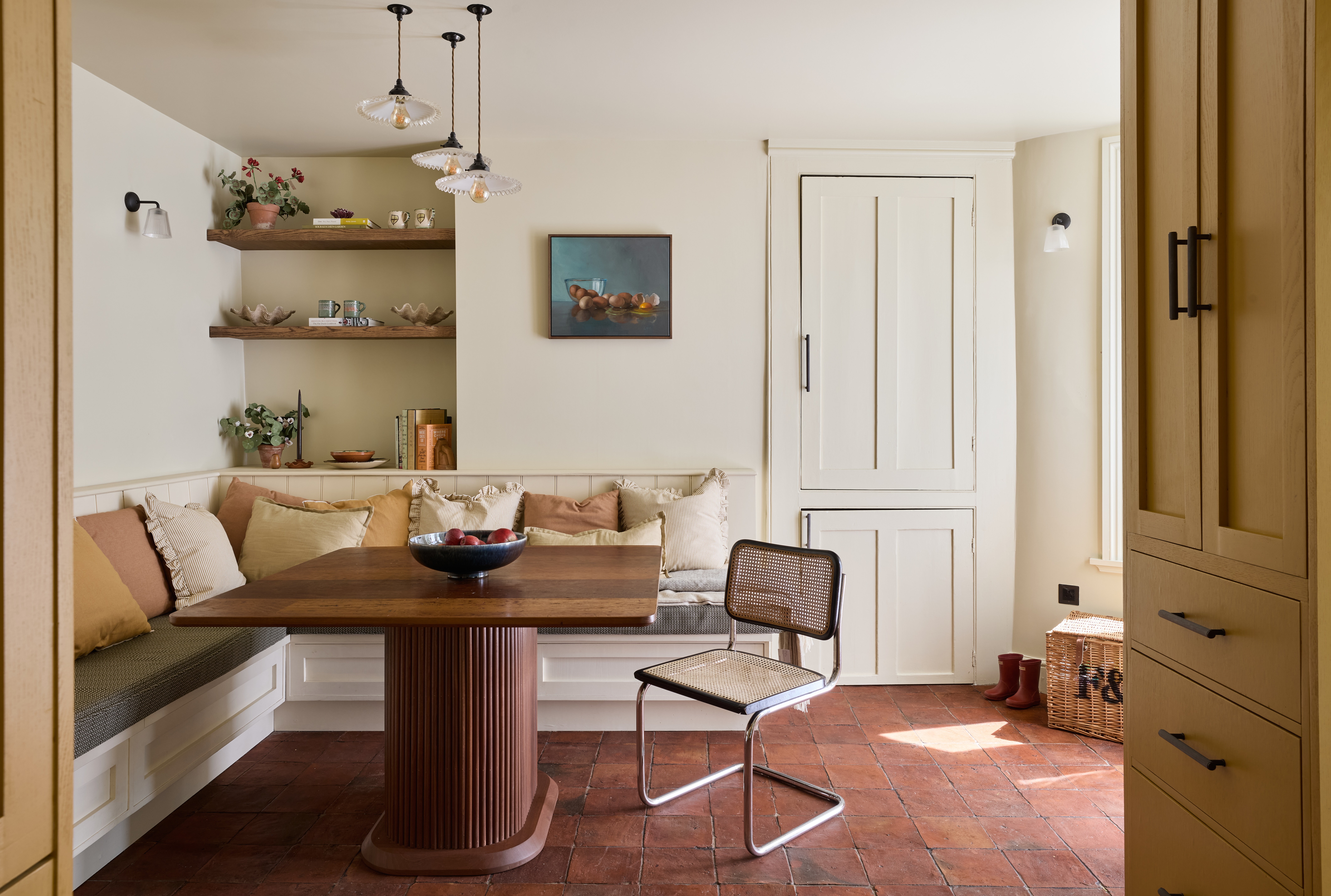
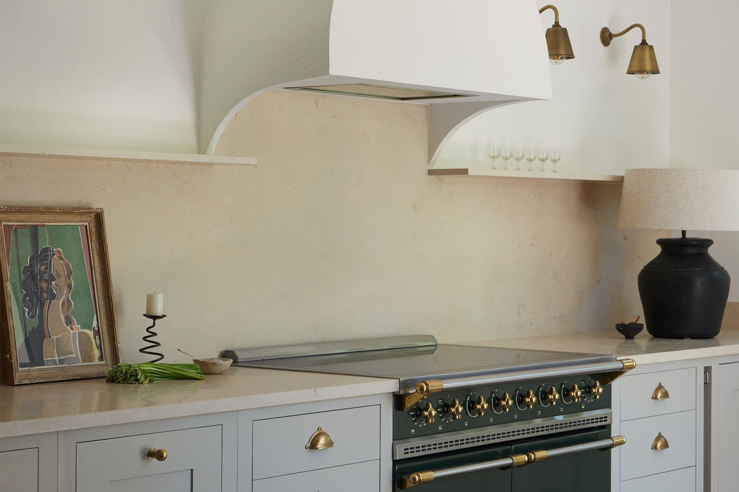
Hollie and her design director, Victoria Bailey-Adamson, absorbed all these personal details and poured them into a thoughtful redesign of their clients’ small suburban kitchen. They installed beadboard walls and traditional cabinetry for a cottage kitchen look; they commissioned a banquette that channels the simplicity of Japanese millwork; they improved the room’s functionality and augmented its storage; and they focused on unfussy, enduring materials in natural tones.
Below, Hollie walks us through the newly transformed room.
Photography by Thomas Leonczik, courtesy of SPACES by Hollie Velten.
