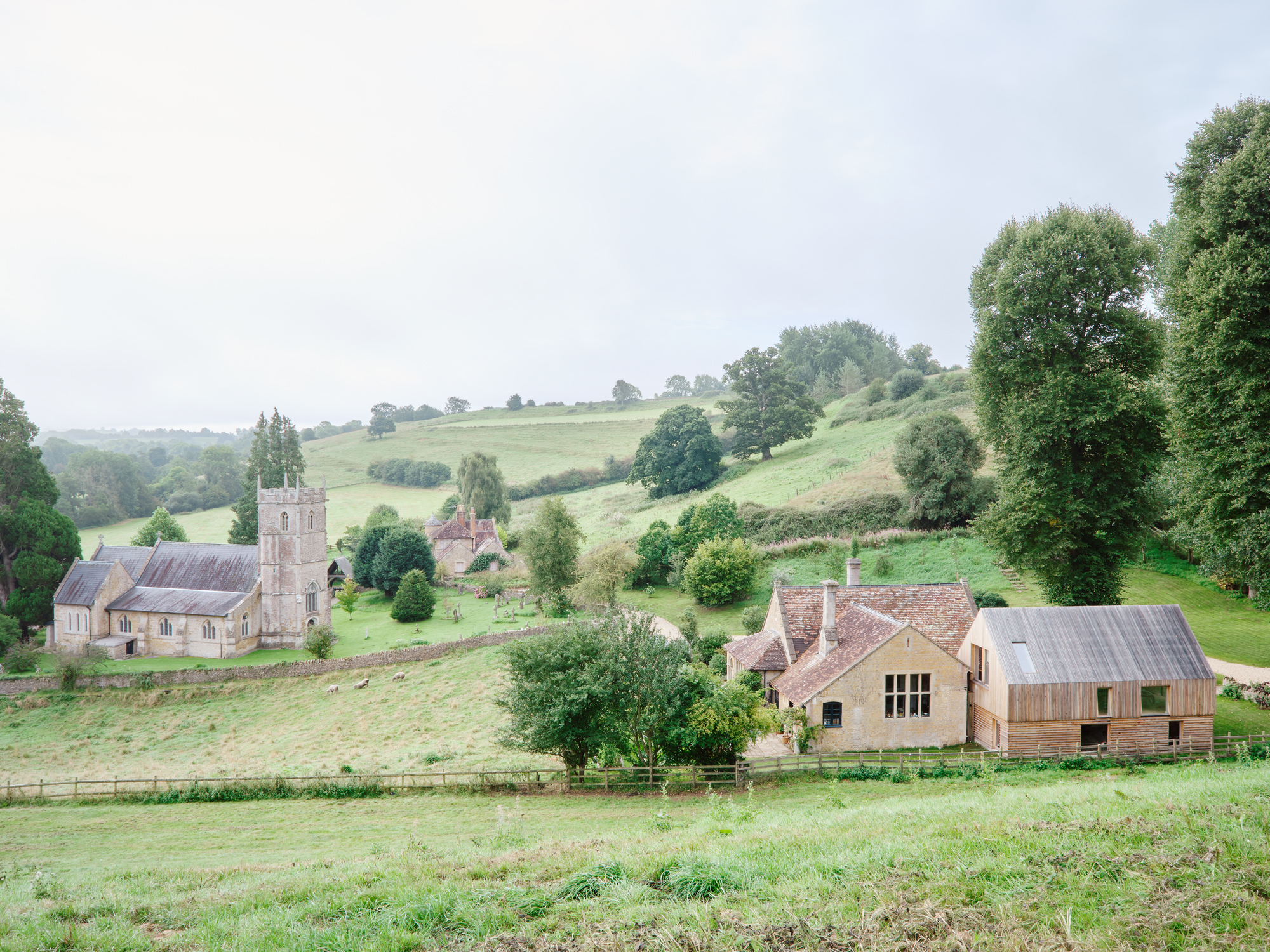
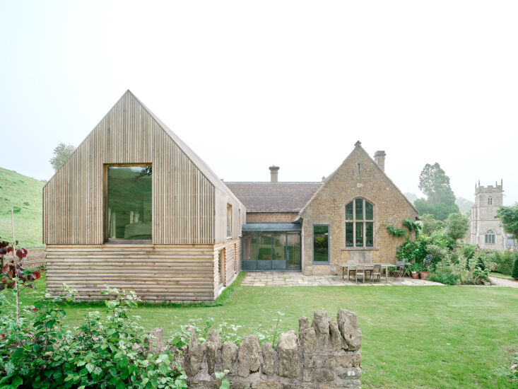
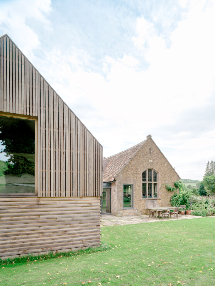
After moving into an 1864 former schoolhouse in bucolic Somerset, England, Farrow & Ball color curator Joa Studholme and her husband realized something wasn’t quite right with the home’s 1970 addition. “It didn’t work properly,” says George Dawes, the architect (and Bindloss Dawes co-founder) who had been hired to fix it. “The corridors were too narrow; the bedrooms were too small for double beds, which is what they wanted. And it didn’t sit well with the original, Grade-II listed building. It just made sense to take it down and start again, which seemed quite radical at the time.”
But the drastic move was the right one: George was able to replace the dysfunctional extension with a modern structure that checks all of the couple’s boxes. Its sleek facade is in harmony with the historic section of the house, mirroring its warm gray hue and pitched silhouette; its practical layout, with an airy primary suite and two full-sized bedrooms, flows easily; and its simple interior architecture allows Joa to play with color. “I am a maximalist, and our architect is quite the opposite,” she says. “This could have been a problem, but we embraced it and were happy that the exterior is all clean lines and the inside the total juxtaposition.”
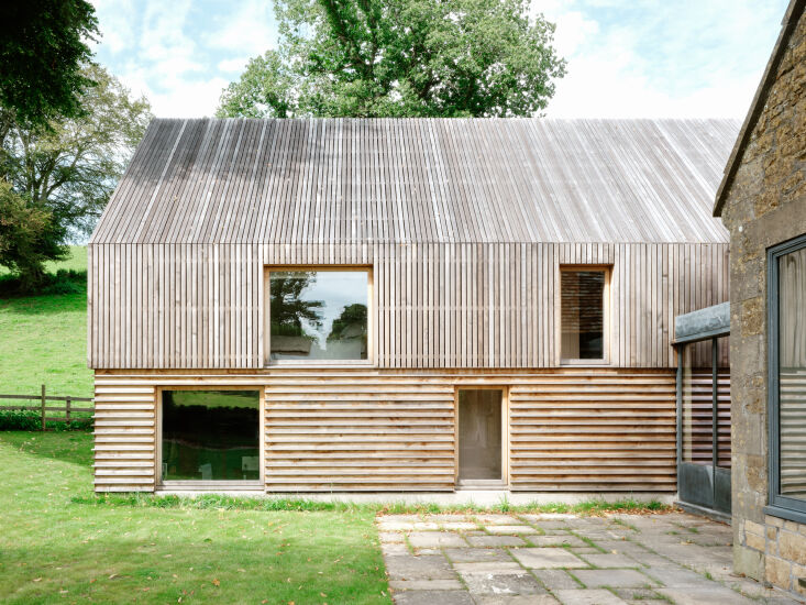
Above: George chose sweet chestnut cladding for the addition because it blends into the lush environment. “When you put contemporary architecture inside a very rural setting like this, you can trash it quite easily if you’re not sympathetic,” he says. “Timber felt like a logical choice because it’s a locally sourced, natural material that you see in the countryside around here.” Photograph by Francesca Iovene.Above: Over time, the wood will take on the same warm gray hue as the 160-year-old stone schoolhouse. “Initially, it comes in a blondie color, but it starts to weather into something much more silver, which actually matches the tone of the original architecture,” George adds. Photograph by Francesca Iovene.Above: The silhouette of the extension mimics that of the historic structure, too. “The shape came about from basically emulating what was there already,” George says. “The mass of the new building is very similar. It’s got the same height. The roof pitch is also 45 degrees. So, compositionally, it’s almost like the younger relative of this very old Victorian thing. But at the same time, it was important to do something contemporary, not pastiche.” Photograph by Francesca Iovene.Above: Modernity is evident in the sharp, geometric details. Wider siding with skinnier slots in between is laid vertically on the top (concealing gutters and pipes), while thinner siding with broader slots in between is laid horizontally on the bottom. The rectangular windows are spaced evenly and intentionally. Photograph by Francesca Iovene.