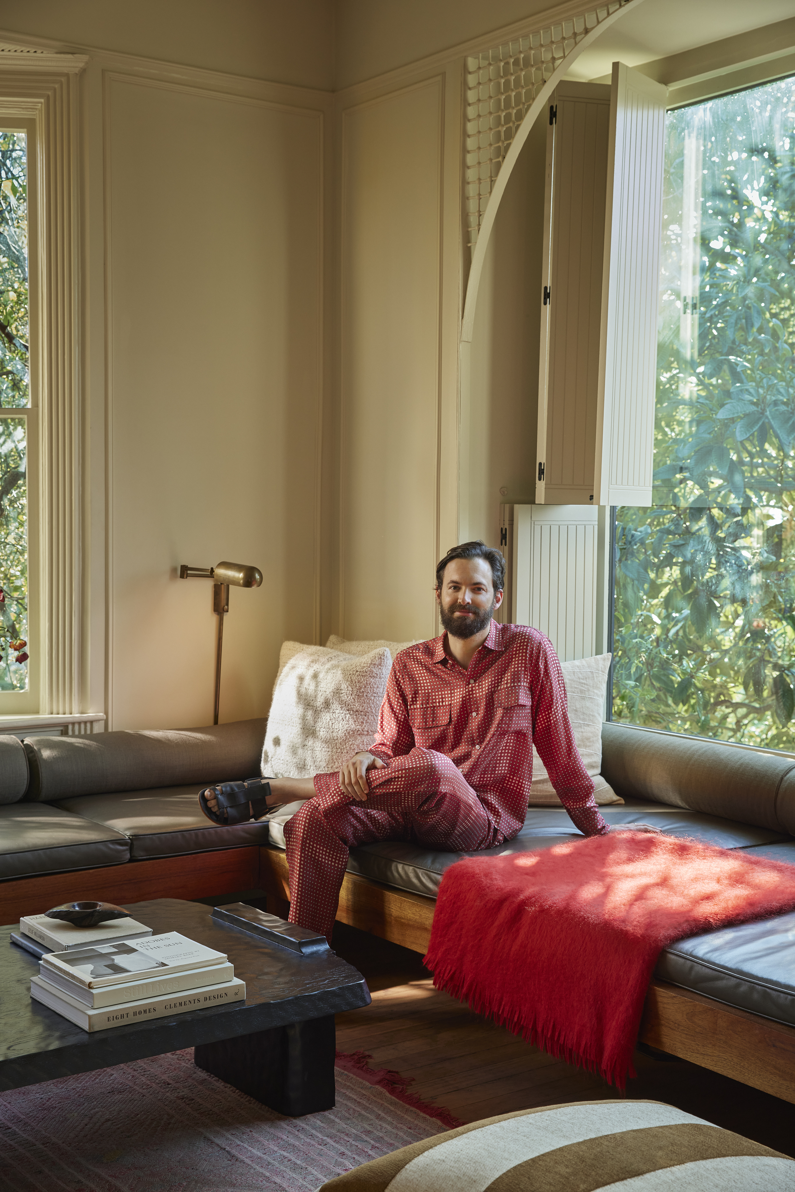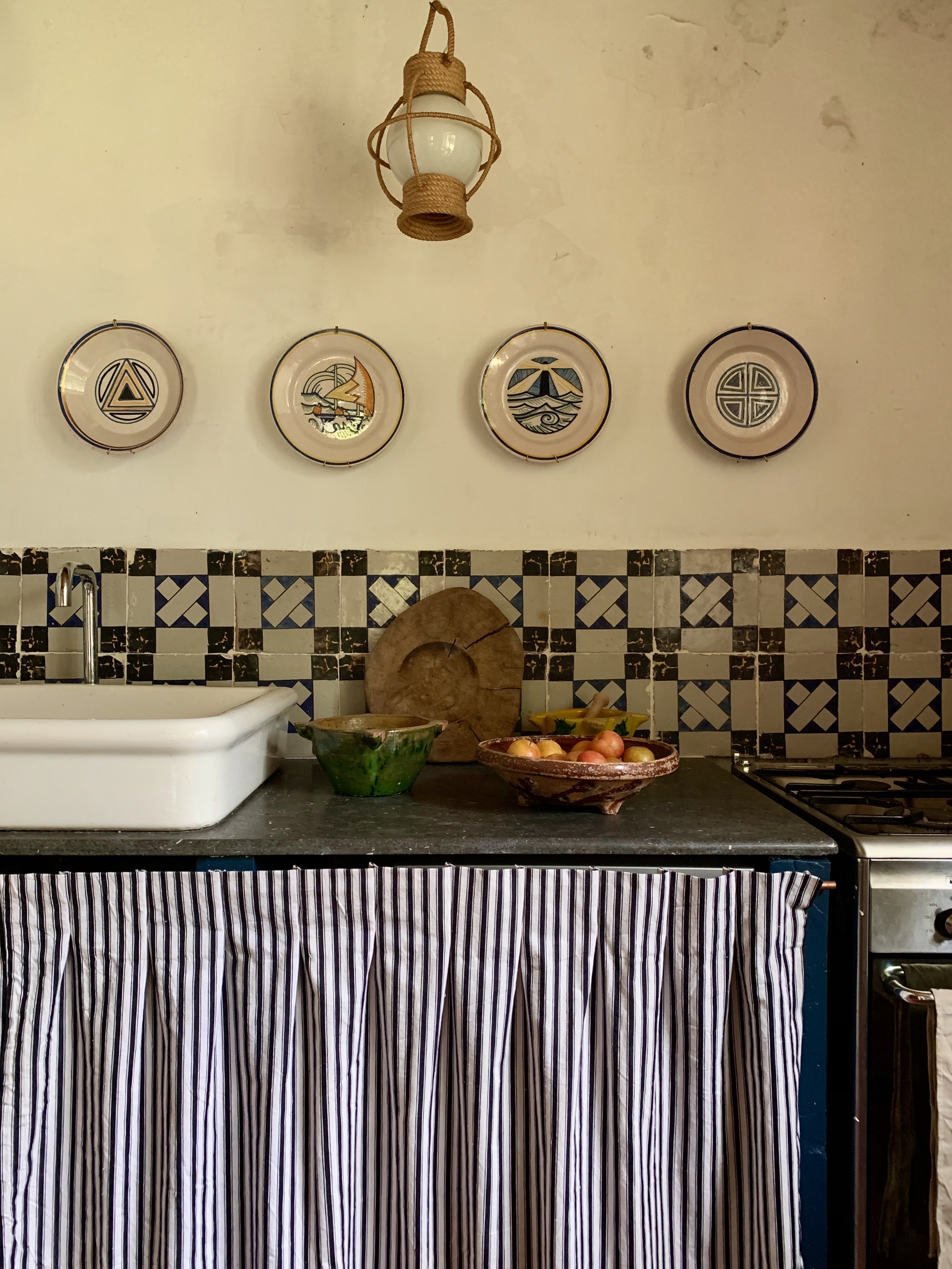
Everybody’s in L.A., and that includes designer Patrick Bernatz Ward. Fan first wrote about Patrick’s work four years ago and later commented, “It’s among my favorite projects I’ve written about”—though, she added, “his own home may top it.”
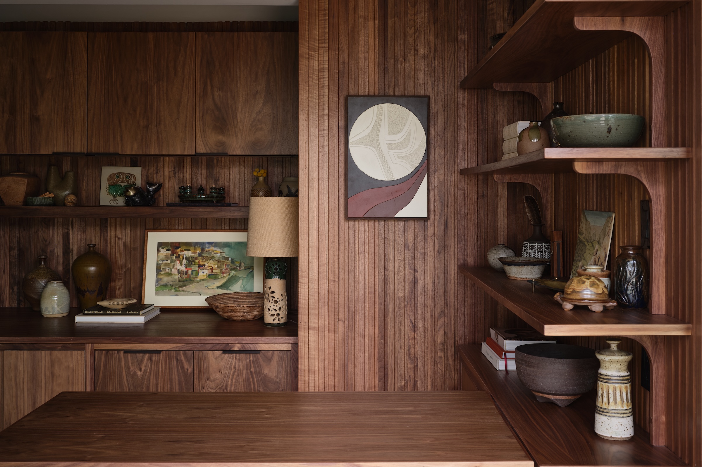
“I’m lucky that our projects vary dramatically by location and type,” Patrick says, “from a ground-up house in Santa Monica to a contemporary studio for a therapist specializing in psychedelic integration to a restoration of a Greene and Greene home in Pasadena.” What they all have in common? Warm materials, earthy color, and a distinct Cali style—all sure signs that you’re looking at a Bernatz.
Today, Patrick shares the books on his bedside table, two soundtracks he’s got on in the background, and the color he likes to add (in small doses).
First design love?
Architect Rick Joy’s work in Tucson, Arizona, along with my grandfather’s Cliff May house in Orange County.
What’s on your bedside table?
My phone charger (although it’s hidden). I honestly keep a selection of my favorite (very worn) architecture books that I’ve had since I was a teenager. This includes books on Sea Ranch, William Turnbull, and Southwest adobes.
What’s your desert island design/architecture-related book?
This changes! Recently I’ve found a 1988 copy of Sally Woodbridge’s Bay Area Houses that I’ve become absorbed with. It includes a lengthy history of First Bay Tradition and its evolution into different style iterations, ranging from the First Unitarian Church in Berkeley to William Wurster’s midcentury designs.
What podcast or playlist do you put on when you need inspiration?
John Adams’ “Century Rolls” and Steve Reich’s “Music for 18 Musicians” are on constant repeat in the studio.
What’s been your best house upgrade?
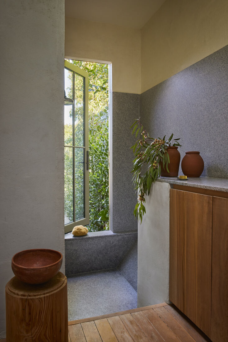
Opening up the entire dining room and kitchen with new operable windows towards the view of Elysian Park and the hills. It has, hands down, transformed our kitchen into a camera obscura of Los Angeles.
My favorite sheets are…
Coyuchi makes a really lovely “cloud brushed” flannel that we use often.
My favorite paint color for the bedroom is…
A balance of local woods and Farrow & Ball’s Old White is always a home run…with maybe a pop of red.
My unpopular design opinion is…
Live in your home for a bit of time before contacting a designer or architect. It’s important to understand how you will utilize a space with your daily routine over time. No need to jump into renovations right away.
Your design pet peeve?
Imported “luxury” materials that do not relate to a property. In addition, they add way too much carbon to the atmosphere. Keep an open mind to local: sustainably driven wood, stone, and tiles.
Favorite design shop to visit (online or in person)?
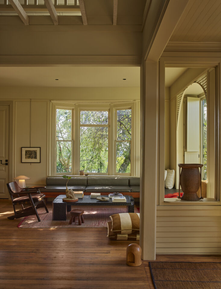
Alex Tieghi-Walker’s gallery Tiwa Select is an endless trove of folk-art inspiration.
What item from your closet do you have on repeat?
I’m definitely a uniform kind of guy. Typically, this includes turtlenecks with shorts and a pair of sandals.
Three words that describe my design style:
Understated. Timeless. Local.
Thanks so much, Patrick! Follow his work via Bernatz and @pbernatz (and see also: Before & After: Architect Pat Bernatz’s Reimagined House on the Hill in East LA and ‘Old California’ in an Updated 1907 Arts & Crafts-Style House in Los Angeles).
(Visited 435 times, 434 visits today)

